

Syracuse Strong 2025 Schedule Poster

Syracuse Strong 05/18/24 Game Day
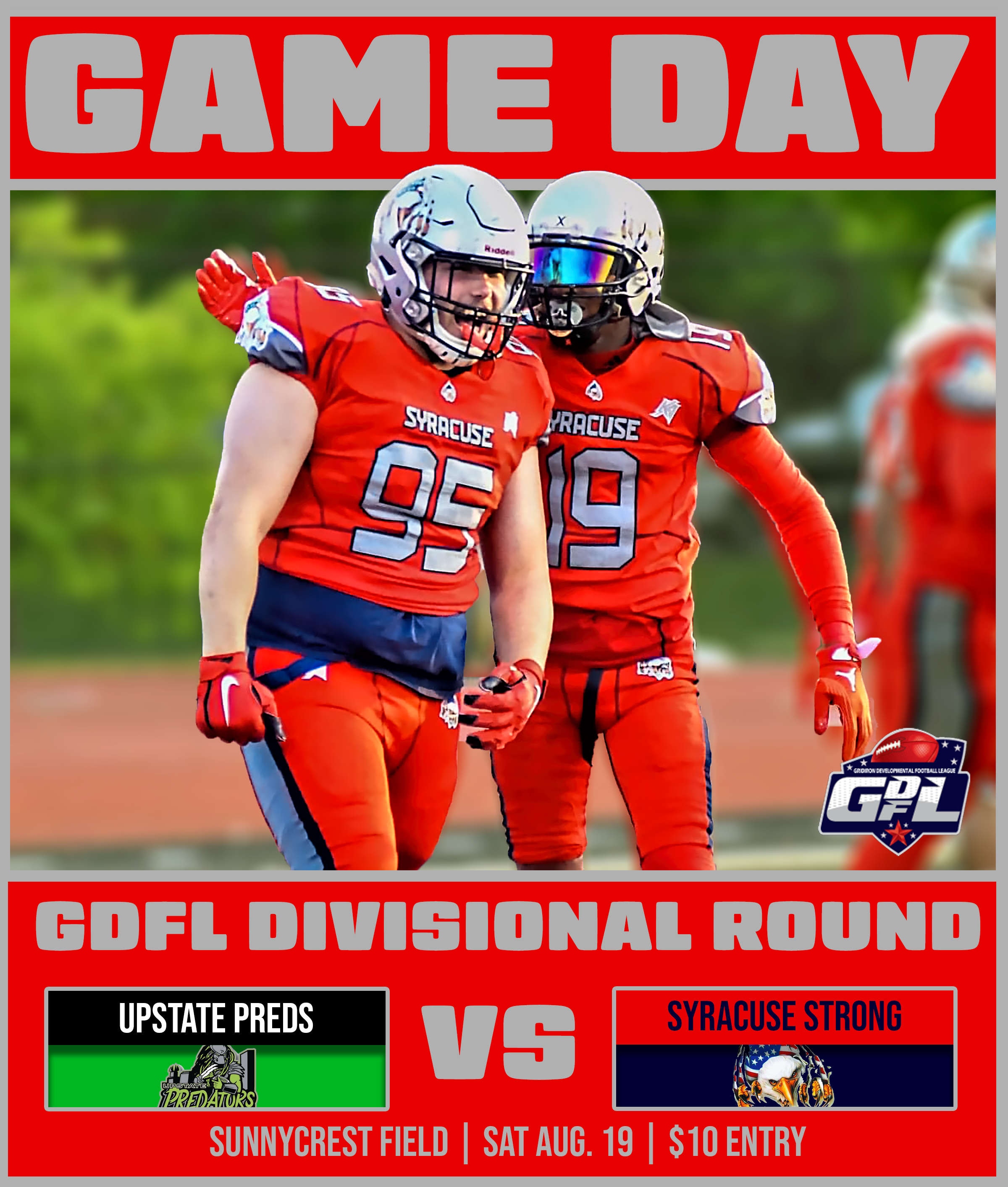
Syracuse Strong 08/19/24 Game Day
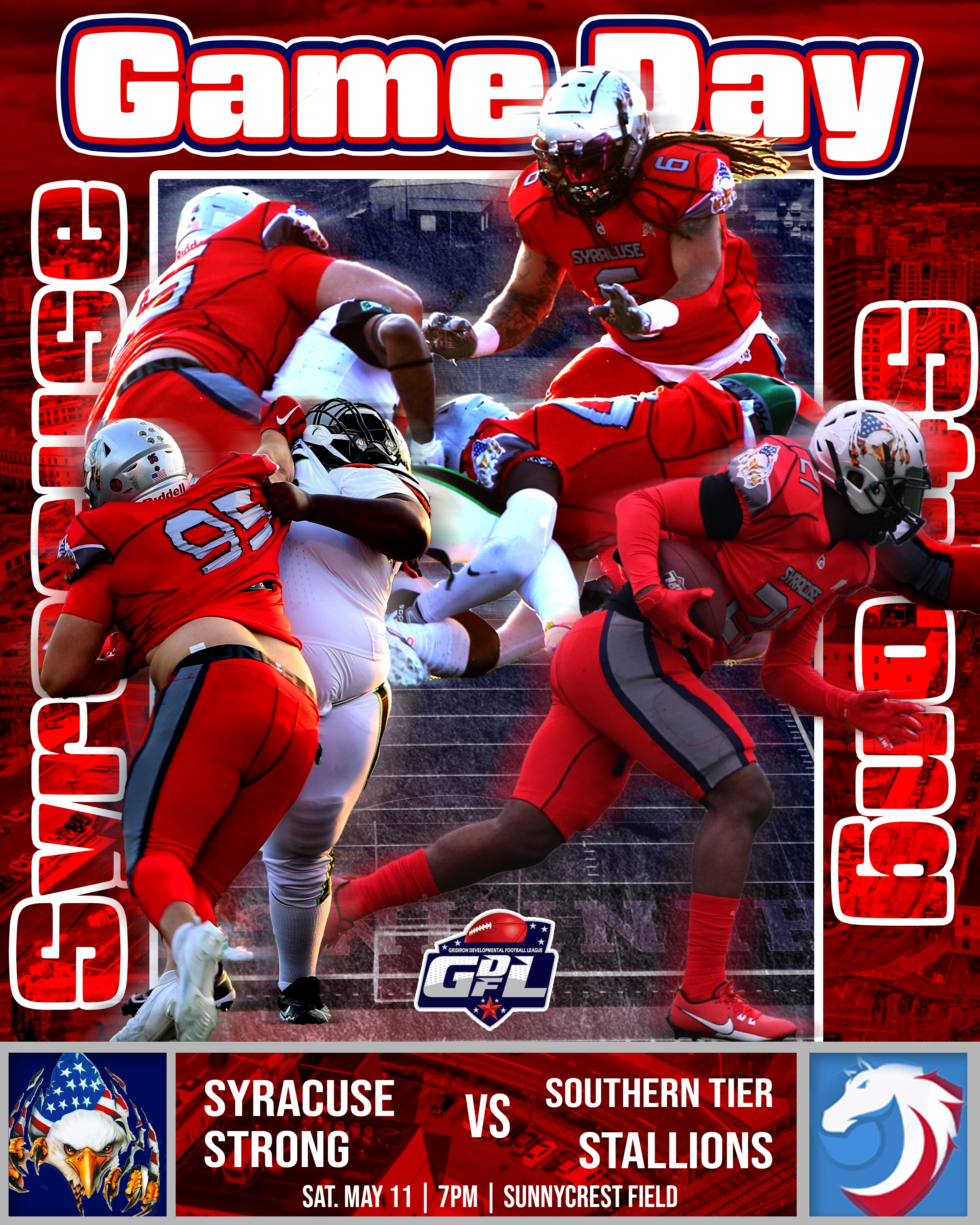
Syracuse Strong 05/11/24 Game Day

Syracuse Strong 06/07/25 Game Day

Syracuse Strong 06/07/25 Final Score
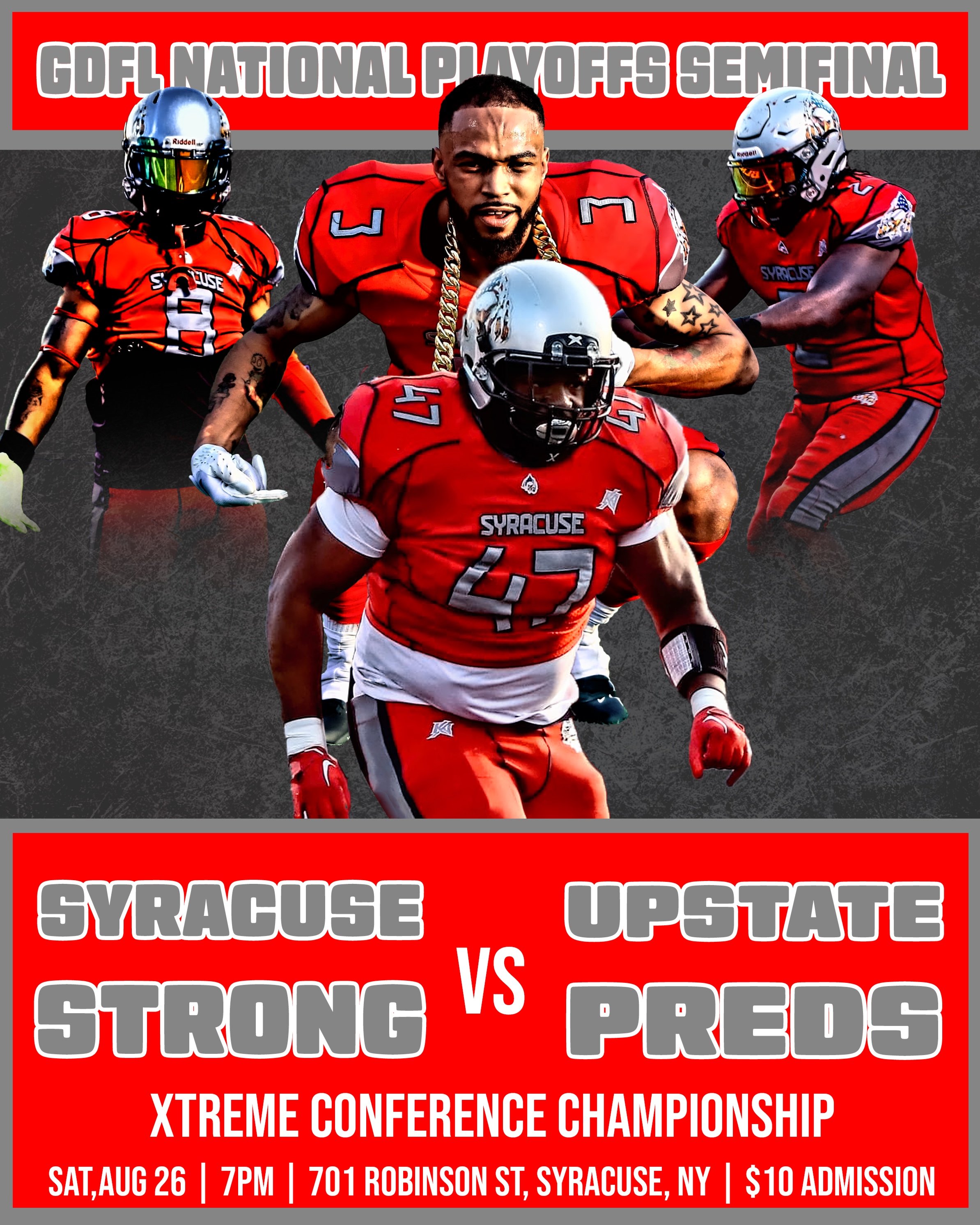
Syracuse Strong 08/26/23 Game Day

Syracuse Strong Season Promo
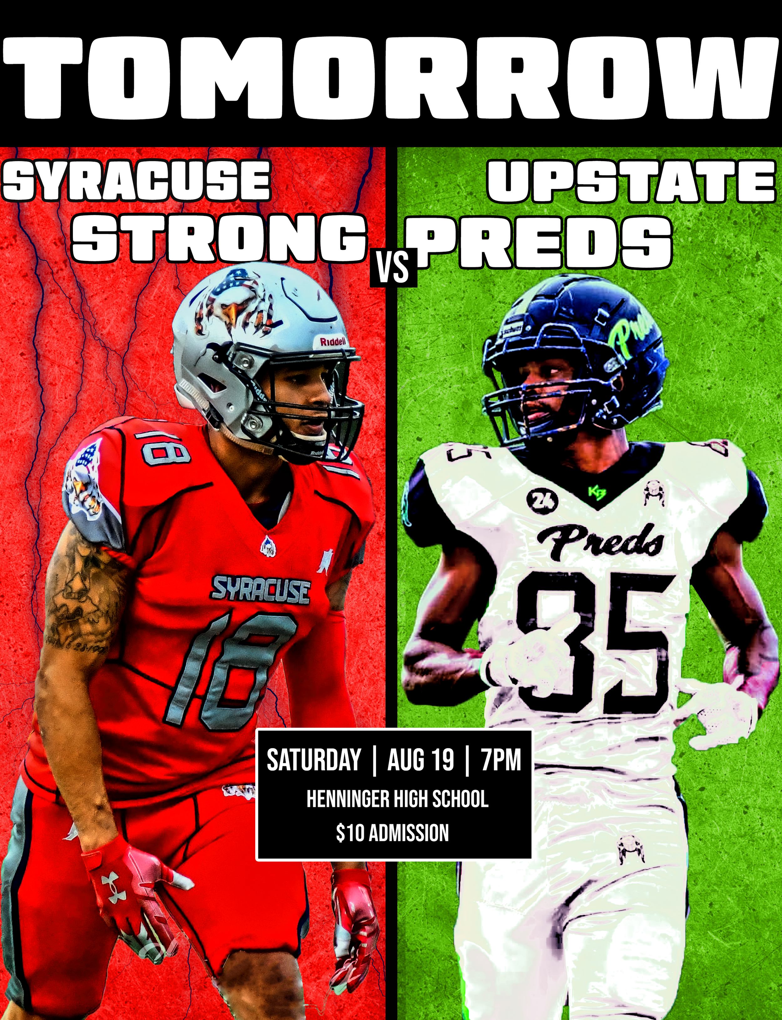
Syracuse Strong 08/19/24 Game Day

Syracuse Strong 06/14/25 Final Score
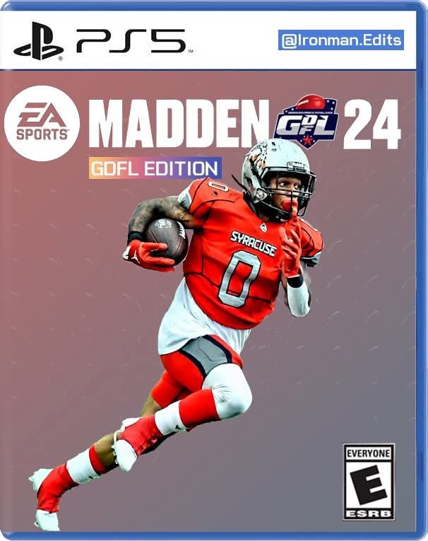
Madden Cover Graphic (GDFL Edition)

Personal Strong Edit

Personal Commission Project

Personal Commission Project
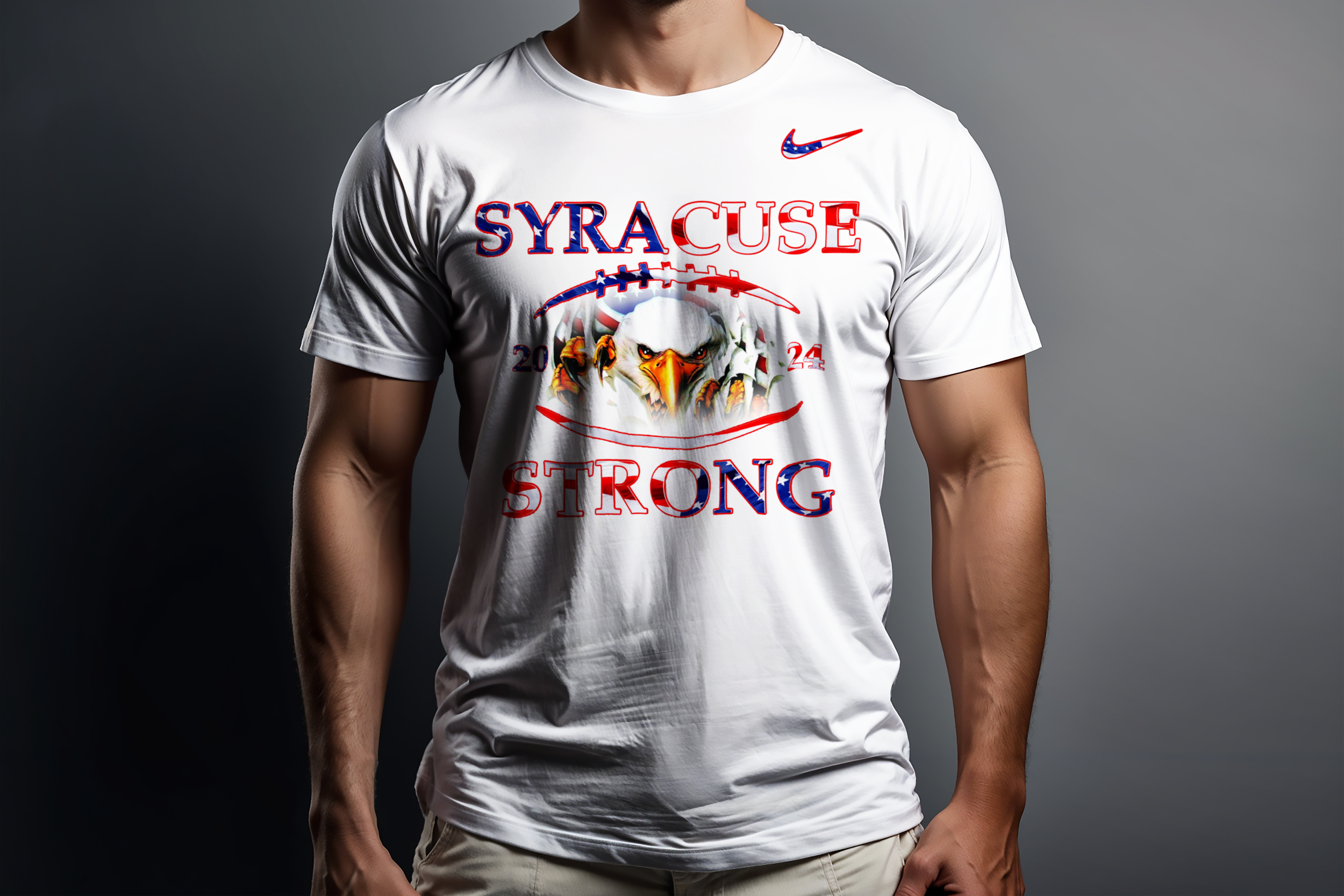
Syracuse Strong Apparel Design

Nikola Jokic Jersey Swap
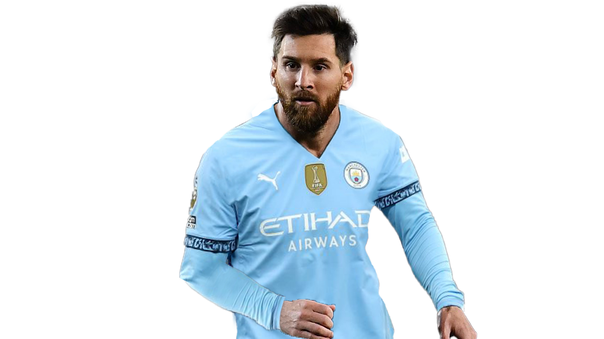
Lionel Messi Jersey Swap

Patrick Mahomes Jersey Swap

Syracuse Strong 06/14/25 Game Day
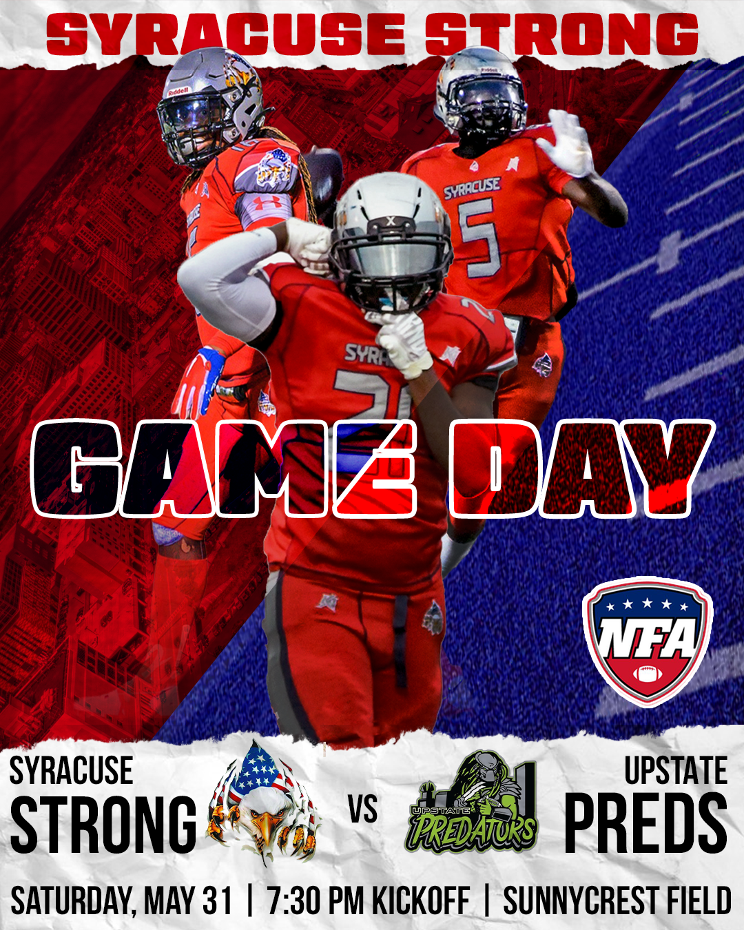
Syracuse Strong 05/31/25 Game Day
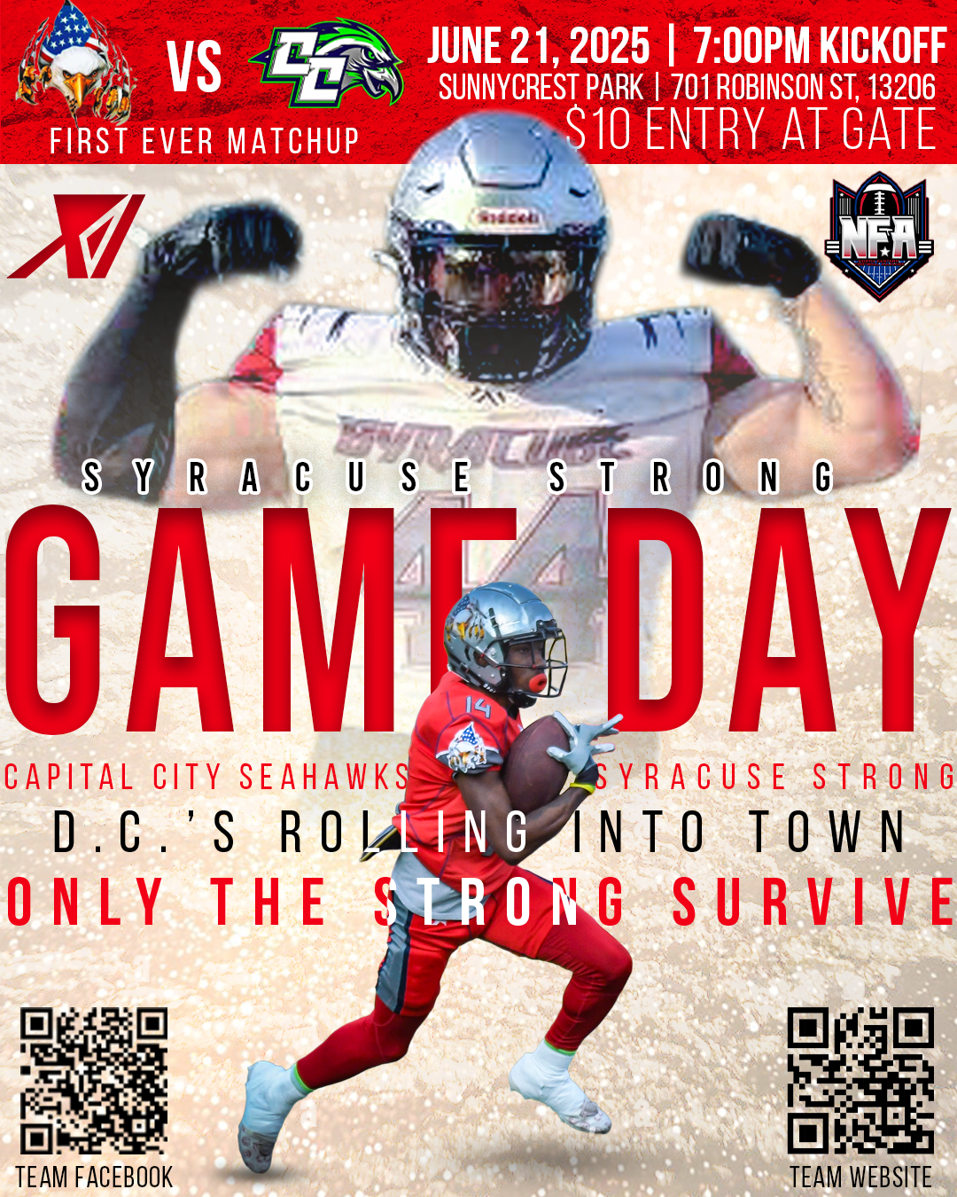
Syracuse Strong 06/21/25 Game Day
Team Underrated
Brand and Uniform Case Study
The Team Underrated logo was designed to represent confidence, ambition, and unity within a competitive AAU basketball culture. Built around a bold "U" crowned with five points, the mark symbolizes the rise of overlooked athletes proving they belong on the court.
The typeface used is CoFo Kabeltouw with a stencil effect to reflect grit and individuality while remaining clean and legible across various formats. The primary version in red and black was made for the boys’ team, while a blue-and-pink variation was developed for the girls’ program to extend the brand’s reach while maintaining visual consistency.
I also created a simplified icon version for profile pictures and social media use, ensuring the brand stayed cohesive and recognizable across all digital mediums.
Logo Design


Uniform Design
Following the logo design, I was tasked with creating the official uniforms for Team Underrated’s AAU program. I led all creative decisions beyond the client-selected colorway (red and black), building a look that felt modern, aggressive, and unforgettable on the court.
The crown icon from the logo was repurposed as a repeating side panel element, reinforcing the brand’s identity without overwhelming the overall design. The type placement and number styling were inspired by classic athletic aesthetics with a contemporary edge, ensuring the kits looked clean in both game-time photos and promotional shoots.
My experience designing fictional teams in video games over the years gave me an instinctive understanding of what makes a uniform pop, and this project let me bring that vision into reality.


Promotional Design


Logo Design
My Personal Logo
My personal brand logo is built around my initials, "XI," and represents more than just a monogram. It reflects who I am as a designer, as well as the influences that have shaped me. From the beginning of the branding process, I knew I wanted my visual identity to pay homage to my alma mater, SUNY Cortland. While the red I use isn't an exact match to the university’s color, it’s a purposeful nod to the chapter of my life where I truly developed as both a designer and a person.
The early stages of this project were rooted in exploration. I experimented with a range of typographic variations and compositions using Adobe Illustrator, all centered around the same core element: the XI. Each variation told a different story. In the middle set of concepts, I noticed that the intersecting forms resembled an hourglass. That sparked the idea of timelessness, a reflection of my goal to create work that fuses foundational design principles with a forward-looking, modern approach.
The bottom logo set had a strong retro energy, reminiscent of vintage video games. I appreciated its nostalgic quality, but it didn’t quite align with the tone I wanted for my personal brand. The top set ultimately became the foundation of my final logo. It was also the clear favorite among my peers and mentors during critique.
From there, I refined the mark further, arriving at the version I use today. The final XI logo uses clean negative space and a slightly angled form to create a sense of motion and energy. The typography and shape come together to form a confident, athletic icon that speaks to my ambitions in sports design, but the visual clarity and structural integrity of the logo also reflect my versatility across branding and visual communication more broadly.
This process was about more than making something that looked good it was about finding a symbol that feels authentic to my identity as a creative. The XI logo is bold, intentional, and adaptable, and I believe it positions me well for a wide range of design roles, both inside and outside the sports world.


Typography and Layout
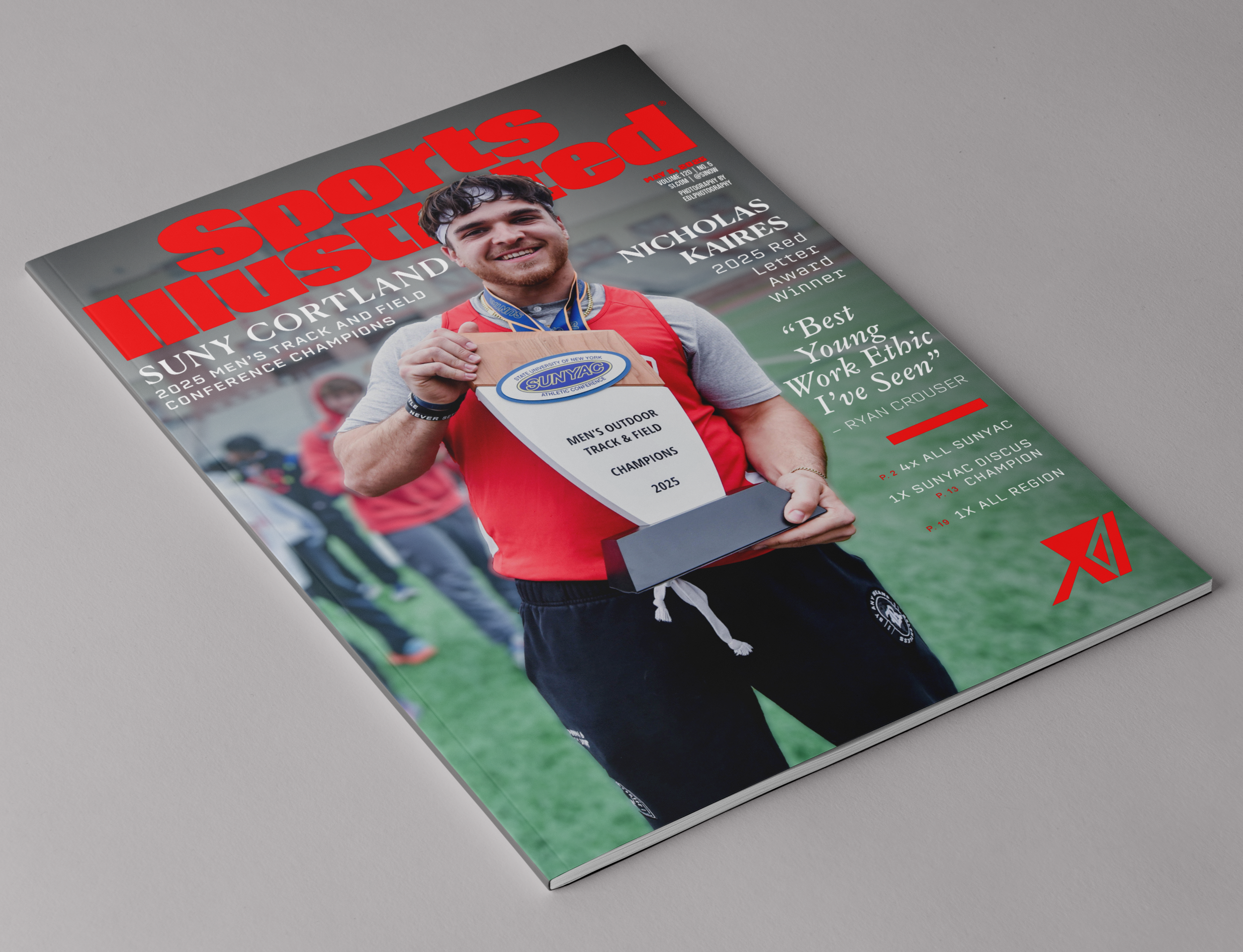
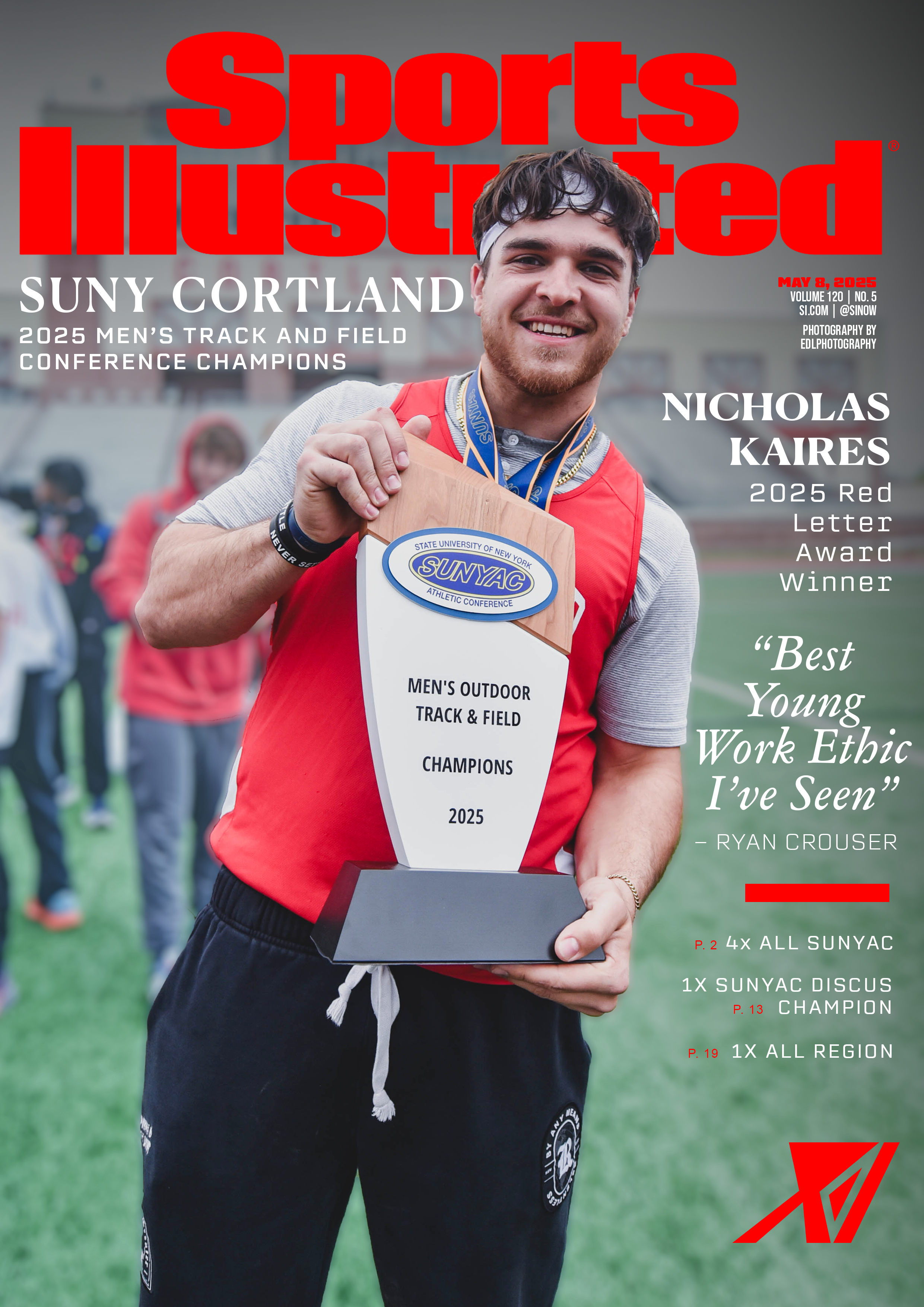
“Sports Illustrated Cover”
As both a designer and an athlete, this series was a dream to create. I’ve been a fan of Sports Illustrated my whole life, so stepping into the role of cover athlete and designer at once was surreal.
The concept blends bold layout, dynamic typography, and visual storytelling to capture the legacy style energy of SI’s most iconic covers. Featuring myself and a friend of mine as the subjects, it was also a personal celebration of identity, passion, and the power of sports media. I plan to expand this into a three-piece editorial series exploring different tones and formats.


“Paper Chase”
This piece is a typographic adaptation of an original rap I wrote, reimagined as a visual poem. I enjoy making music in my free time, and this project gave me a chance to merge two of my creative passions: lyricism and design.
“Paper Chase” is a direct reflection of my personal journey through struggle and ambition. It wasn’t made to be cryptic, it was made to be felt. The typography creates tension, the layout becomes the chase, and the message stays clear: keep pushing forward, no matter the odds.


Collectible Card Project
This project was inspired by the collectible sports cards I grew up with, especially from brands like Topps and Panini. I wanted to pay homage to those classic designs while creating something original that reflected my own aesthetic and branding. It was a chance to blend nostalgia with modern design and showcase how personal storytelling can be integrated into visual identity.
Each card was designed to reflect the team colors and background of the featured player. For my own card, I used red and black to match the colors of the Syracuse Strong, the semi-pro football team I both play for and design for. For my brother Scott, I created a card that honors his college football days at SUNY Morrisville, using a green and white color scheme that represents his team.
One of the most important aspects of this project was the typography and layout. I went through several font combinations before finding the right ones that truly fit the look and feel of a collectible card. The header font, Bungee, brings a strong sense of athleticism through its blocky, bold style, while also giving off a subtle retro vibe that ties back to the cards I collected as a kid. For subtext, I used Bebas Neue and Bebas Kai, both of which offer great readability and align perfectly with the clean, impactful tone that sports branding demands.
To enhance the atmosphere of each card, I incorporated gritty textures and layered effects that convey the toughness and emotion of football. In the card featuring me, I added a subtle cityscape of downtown Syracuse in the background as a tribute to the city that the Strong call home.
This project was a great opportunity to explore how design can capture emotion, identity, and narrative all at once. It reflects my attention to detail, my ability to merge concept with execution, and my passion for both sports and visual storytelling.


Social Media
Instagram Deployment Preview – SUNY Cortland Art Series
During my internship with the SUNY Cortland Art Department, I was tasked with creating promotional graphics to increase awareness of the program across campus and online. As a transfer student from OCC, I realized how underrepresented the department was despite its strong facilities, talented students, and supportive faculty. This project gave me the chance to not only design for a cause I believed in, but also capture photography from real classrooms and events like the Student Select gallery show.
The goal was to create scroll-stopping content that could be used across Instagram and other platforms, highlighting the variety of mediums taught in the program while reinforcing my alma matter’s consistent visual brand identity in order to draw in prospective students. These designs reflect my approach to creating content that informs, invites, and represents the energy of the people behind it.


Digital Illustration
Oxymoron Series
This project explores the visual expression of oxymorons which are concepts that seem contradictory but can oftentimes hold different meaning entirely when paired together. I set out to illustrate these tensions through simple, thought provoking compositions. I created all of these pieces on Adobe Illustrator, switching from an iPad and to my Mac, allowing me to hand draw certain elements with an Apple Pencil while using its more sophisticated counterpart on desktop.
In the first piece, two figures are shown engaged in hand-to-hand combat while smiling, capturing the duality of a “friendly fight,” where aggression and camaraderie intersect.
The second illustration features a person sitting still on a treadmill, suggesting the idea of “going nowhere fast” which is a commentary on the feeling of expending energy without making progress.
Lastly, the third composition portrays a figure simultaneously crying and smiling, embodying the emotional complexity of “happy tears,” where joy and sadness coexist in a single moment.

“Ice Bears”
This composition features three polar bears huddled together in the middle of a blizzard, symbolizing me and my younger twin sisters. Being over a decade older than them, I’ve always seen myself as a protective figure. Bears, often associated with both strength and guardianship, felt like the perfect metaphor.
The large bear represents me, wearing a red shirt to give it human qualities and emphasize that this piece is about more than just animals. It is a personal expression of myself and my family. The two smaller bears, representing my sisters, are cuddled up against the larger one, seeking warmth, comfort, and protection. I decided on using red as the color for my shirt to represent an urgency of protecting my younger sisters and the potential aggression against someone who would jeopardize their safety.
Beyond their fierceness, bears can also be soft and nurturing, like teddy bears. I wanted this piece to capture both sides: protective and tender. It is behind this idea that I decided upon the composition for the larger bear to be standing over the smaller ones in a gesture of protection while they seek solace in his presence. The title “Ice Bears” is a nod to We Bare Bears, a cartoon my sisters and I watched growing up. Our favorite character, “Ice Bear,” was a quiet and strong figure, much like how they see me.
