
Collectible Cards
This project was inspired by the collectible sports cards I grew up with, especially from brands like Topps and Panini. I wanted to pay homage to those classic designs while creating something original that reflected my own aesthetic and branding. It was a chance to blend nostalgia with modern design and showcase how personal storytelling can be integrated into visual identity.
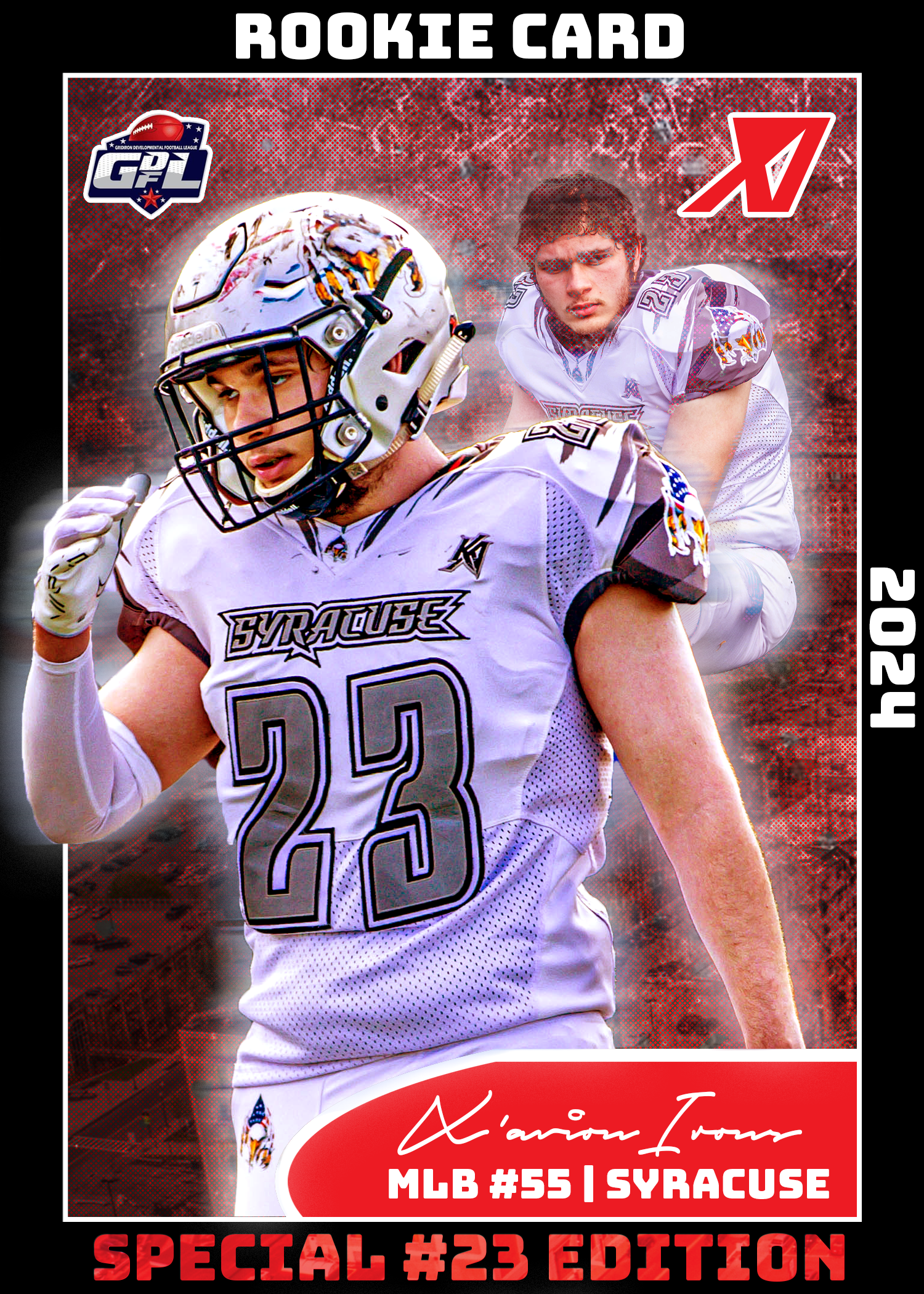
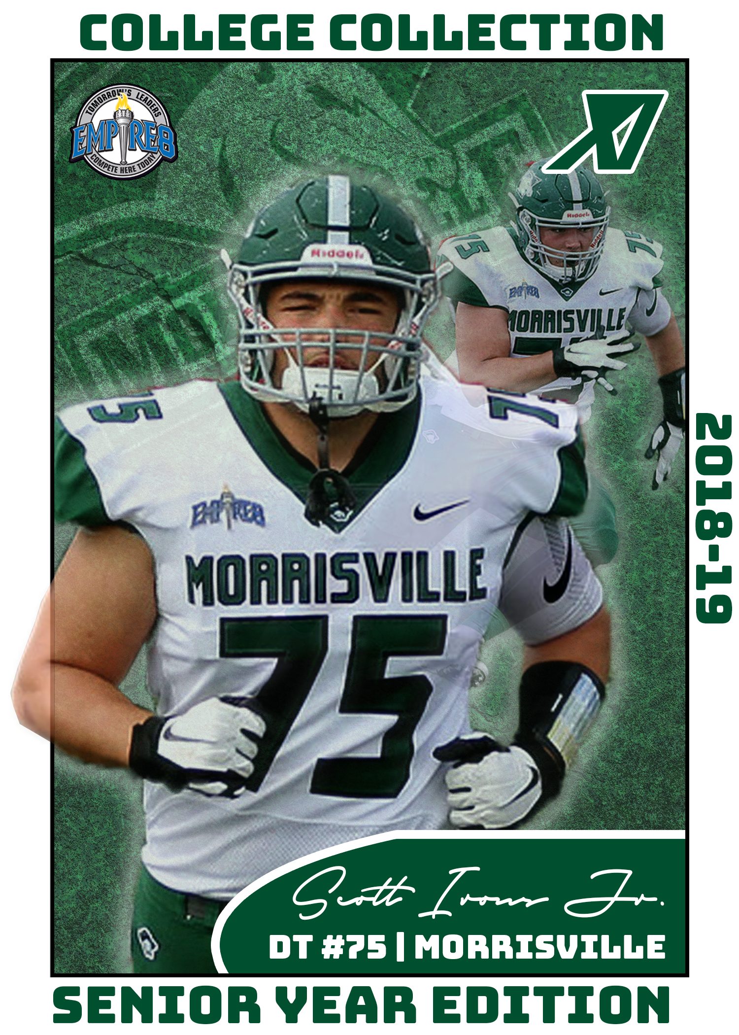
Each card was designed to reflect the team colors and background of the featured player. For my own card, I used red and black to match the colors of the Syracuse Strong, the semi-pro football team I both play for and design for. For my brother Scott, I created a card that honors his college football days at SUNY Morrisville, using a green and white color scheme that represents his team.
One of the most important aspects of this project was the typography and layout. I went through several font combinations before finding the right ones that truly fit the look and feel of a collectible card. The header font, Bungee, brings a strong sense of athleticism through its blocky, bold style, while also giving off a subtle retro vibe that ties back to the cards I collected as a kid. For subtext, I used Bebas Neue and Bebas Kai, both of which offer great readability and align perfectly with the clean, impactful tone that sports branding demands.
To enhance the atmosphere of each card, I incorporated gritty textures and layered effects that convey the toughness and emotion of football. In the card featuring me, I added a subtle cityscape of downtown Syracuse in the background as a tribute to the city that the Strong call home.
This project was a great opportunity to explore how design can capture emotion, identity, and narrative all at once. It reflects my attention to detail, my ability to merge concept with execution, and my passion for both sports and visual storytelling.


What started as a personal passion project quickly turned into one of my favorite things I’ve ever designed. These cards are more than graphics—they’re a way to give semi-pro players the spotlight they deserve. Every detail, from the layout to the branding, was crafted with care and authenticity. I’d love to eventually create full sets for entire teams, giving athletes something physical and official to represent their journey on and off the field.
All work done in Photoshop